Coursera ⋅ Mobile redesign

This project focused on redesigning the Coursera iOS and Android apps with the goal of reducing navigation complexity, increasing course progress and aligning with the brand’s new look and feel.
Project goals

Make mobile a flagship experience
Show how a mobile strategy could not only improve the native clients, but also help push the entire ecosystem to be more streamlined and contemporary.

Simplify architecture and navigation
Examine the architecture for opportunities to simplify and streamline the navigation removing inconsistencies between iOS and Android.

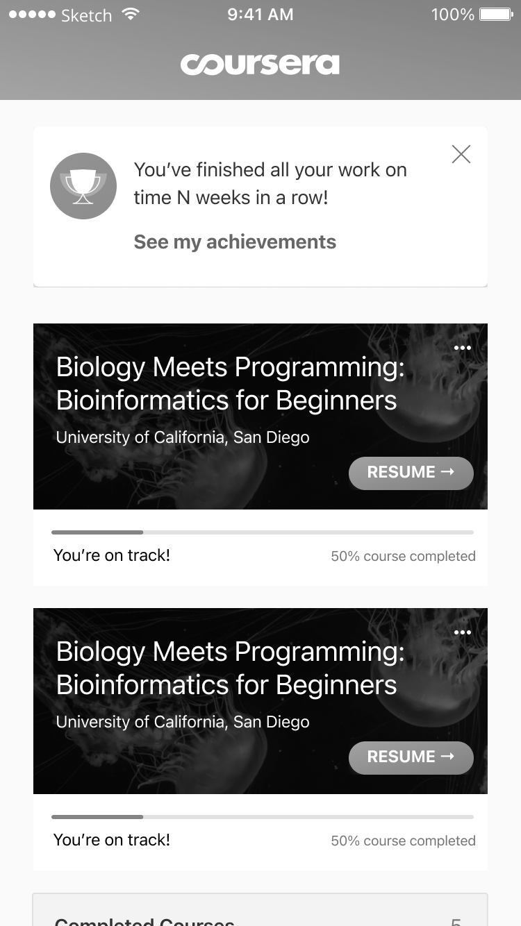
Redesign course progress
Improve progress indicators for courses and assignments to highlight the things students should be doing to complete the course.
My role
Acting as one of three leads on the design team, I worked on the highest impact projects and helped direct the work of three other designers. On this project I partnered with two other designers and we kicked off an aggressive quarter aimed at revolutionizing the mobile user experience and pairing it with a visual design refresh.
UX design
Led the discovery, strategy, ideation, user testing and detailed UX designs.
Visual design
Led the visual design refresh and worked with the other designers to improve our delivery and prototyping capabilities.
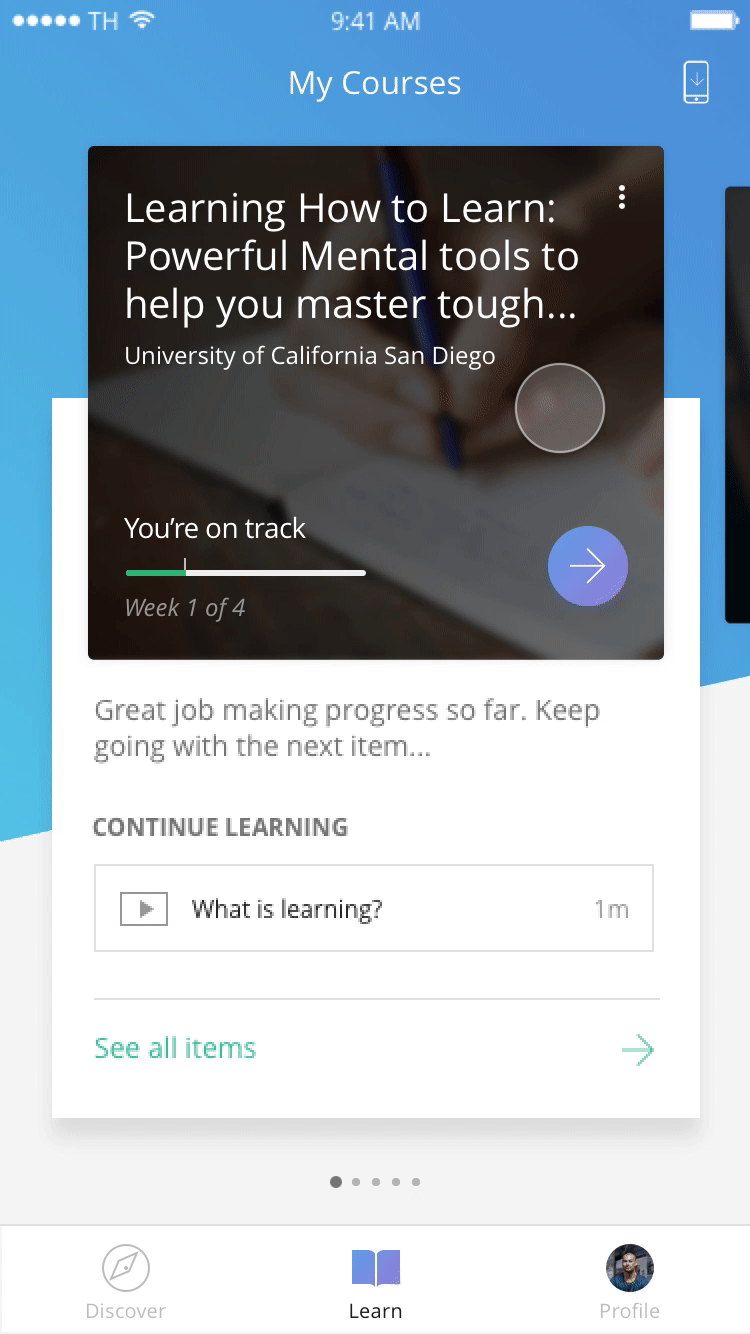
Mobile experience
The mobile experience had the unfortunate label of being a “companion” to desktop. We sought to elevate the mobile platform to be a first class citizen.

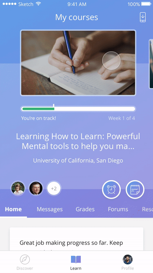
We kicked off this project with an extensive audit of the current app. From the My Courses screen, one can recognize how inconsistent the experience between platforms was. The builds were also a mash up of the box components and custom engineered UI. This significant variation produced a mobile experience that was hard to update and contained significant design and engineering debt.
Where we started
iOS

Android

Audit

iOS
Android

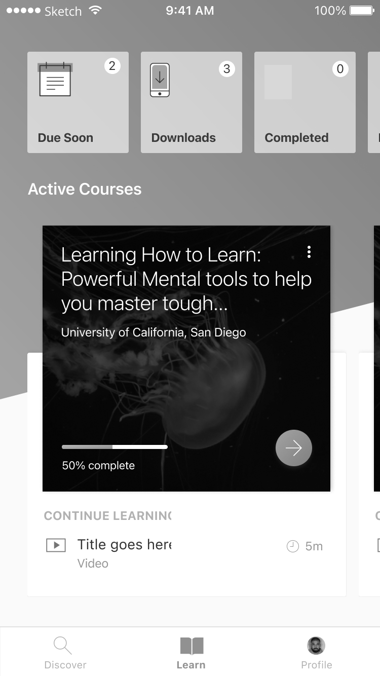
Architecture
Our new architecture was divided into 3 main buckets:
Discover Search and browse
Learn The core course experience
Profile A new location where accomplishments settings and personal info could be housed

Ideation
Cross functional design sprints helped uncover current pain points and reveal opportunities for improving the user experience. Whiteboarding sessions and wireframe explorations helped refine our concepts.


Early course home explorations
More refined concepts


User testing

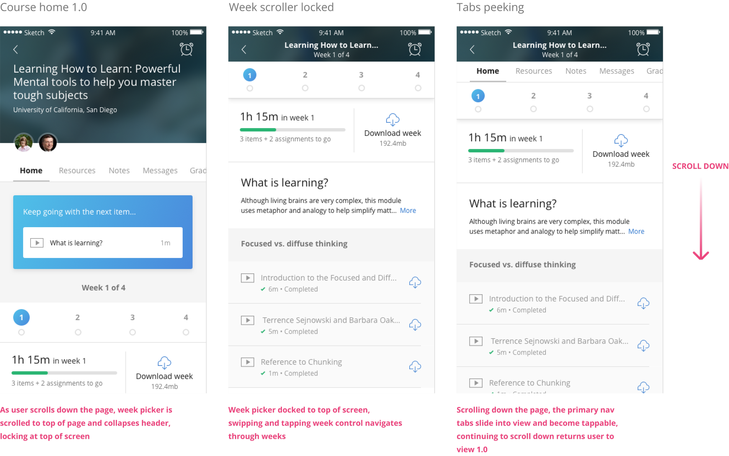
We built two high fidelity prototypes in Principle and tested the designs on device. The new designs illustrated significant changes to course navigation, progress, you are here indicators like “next step” and several smaller interaction changes like our "week switcher” concept.
Concept 1
Concept 2


Course navigation
Assignment consumption
Course navigation
Course consumption
UER findings
The research sessions led us to move forward with Concept 1.
Users gravitated to the at a glance progress in these concepts and the organization of courses seemed to align with their mental model.
Detailed design


Card display logic
Progress states
Course completion
Course home

Profile, certificates, course history
Desktop experience
Building on the excitement for the mobile work, I started producing some early desktop redesign concepts. We recently wrapped up a design sprint and journey mapping workshop and have been concepting improvements to the web learning experience.


